The Truth Behind the Colors: How NASA Translates Invisible Infrared Data into Webb’s Iconic Cosmic Portraits

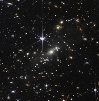
The teal peaks and orange haze of the Cosmic Cliffs, the Carina Nebula image that helped introduce the James Webb Space Telescope to the world in July 2022, do not exist in the way they appear to the human eye. In fact, none of the light recorded by the telescope is visible to human biology. Every filter utilized to assemble that specific, breathtaking portrait of the NGC 3324 region resides deep within the infrared spectrum. Understanding the discrepancy between what the telescope "sees" and what we perceive is not a diminishment of the imagery, but rather an invitation to appreciate the profound scientific rigor required to map the invisible universe into a format our brains can process.
The Physics of Invisible Light
To comprehend the nature of James Webb Space Telescope (JWST) imagery, one must first understand the limitations of human vision. The human eye is biologically calibrated to perceive electromagnetic radiation between approximately 0.4 and 0.7 microns—the range we call visible light. Webb, however, was engineered specifically to transcend these boundaries. Its primary imager, the Near-Infrared Camera (NIRCam), operates within a range of 0.6 to 5 microns, while the Mid-Infrared Instrument (MIRI) extends that reach to approximately 28 microns.
This design choice is intentional and driven by the fundamental expansion of the universe. As light travels across billions of light-years from the earliest stars and galaxies, the expansion of space stretches those wavelengths, shifting ultraviolet and visible light toward the longer, redder end of the spectrum—a phenomenon known as cosmological redshift. By observing in the infrared, Webb effectively functions as a time machine, capturing the faint glow of the first luminous objects that would be entirely invisible to optical telescopes like Hubble. Furthermore, infrared light possesses the unique ability to penetrate dense, opaque clouds of interstellar dust. While optical telescopes are often blocked by these cosmic curtains, Webb peers directly into the heart of stellar nurseries, revealing the intricate processes of star formation that were previously shrouded in mystery.
The Grayscale Foundation of Astronomical Imaging
A common misconception is that Webb’s sensors function like a digital camera, capturing color in a single exposure. In reality, Webb’s detectors are entirely monochrome. Each of NIRCam’s ten light-sensitive chips records only intensity—a single numerical value per pixel representing the amount of photons detected. There is no inherent color information in the raw telemetry.
When a "picture" is taken, the telescope captures a grayscale frame. If the telescope were to beam back raw data without the intervention of science visualizers, the public would see nothing more than high-resolution, black-and-white data sheets. The process of transforming these thousands of grayscale frames into the vibrant, high-definition mosaics released by NASA involves a sophisticated methodology known as chromatic ordering.
The Chronology of Data Processing
The assembly of an image like the Cosmic Cliffs follows a strict, logical sequence:
- Data Acquisition: The telescope captures the same patch of sky through multiple, distinct filters. Each filter acts as a physical gate, allowing only a specific slice of the infrared spectrum to reach the detector.
- Filter Selection: Webb utilizes 29 filters for NIRCam and 9 for MIRI. Some are "broadband," capturing a wide range of wavelengths, while "narrowband" filters are precision-tuned to isolate the light emitted by specific chemical elements, such as molecular hydrogen.
- Chromatic Mapping: Scientists assign visible colors to these grayscale frames based on the wavelength of the light captured. The shortest infrared wavelengths are assigned the shortest visible colors (blue/violet), while the longest infrared wavelengths are assigned the longest visible colors (red/orange).
- Stacking and Balancing: The individual frames are layered together, and mathematical functions are applied to normalize brightness. This process ensures that faint structures are brought into view without washing out the high-intensity regions, a technique similar to the "dynamic range" adjustments found in professional photography.
Expert Perspectives on Scientific Visualization
The team at the Space Telescope Science Institute (STScI) often refers to this process as "representational color." Alyssa Pagan, a science visuals developer at STScI, has frequently addressed the public’s skepticism regarding the "reality" of these images. She maintains that the labeling of these images as "fake" is a fundamental misunderstanding of the medium. "In terms of assigning color, we generally do some standard chromatic ordering because it has the most scientific value and meaning," Pagan notes.
The decision-making process is not purely aesthetic; it is a blend of data-driven science and pedagogical necessity. Joe DePasquale, another lead visuals developer at STScI, explains that flexibility is sometimes required to ensure clarity. For instance, if two different filters capture data that would both result in a red color, the team may shift one to a contrasting color—such as cyan or yellow—to ensure that distinct physical features do not blend together. This is not an act of deception, but an act of translation. By maintaining the relative wavelength relationship, the team ensures that the "map" remains scientifically accurate, even if the color palette is a human choice.
The "Cosmic Cliffs": A Case Study
When observers look at the Cosmic Cliffs in the Carina Nebula, they are seeing a region of ionized gas and dust approximately 7,600 light-years away. The structures, which resemble jagged mountain ranges, are actually the edges of a massive gas cavity carved out by the intense ultraviolet radiation and stellar winds from massive, young stars located outside the frame.
The colors observed in the image act as a legend. The orange, cloudy regions represent lower-energy, longer-wavelength infrared light interacting with dust. The deep, dark blue-black regions represent areas of lower density or specific shorter-wavelength emissions. When researchers point to a "pink" spot on a Webb image, they are indicating the presence of warm, glowing dust or specific molecular signatures, not the actual color the human eye would see if it were floating in that sector of space.
Broader Implications and Scientific Integrity
The public’s fascination with Webb’s images has led to a broader cultural debate regarding the nature of scientific representation. However, the scientific community maintains that these images are the most accurate representations of the universe ever produced. The structure of every filament, the position of every star, and the density of every nebula are measured, verified, and mapped with extreme precision.
The transition from raw, invisible data to vibrant, colored imagery serves as a critical bridge between the cold, hard numbers of astrophysics and the human capacity for wonder. By rendering the invisible visible, NASA provides a window into the evolution of galaxies and the birth of stars that would otherwise remain closed to the public.
Ultimately, the distinction between "real" and "chosen" is a false dichotomy in the context of astronomical imaging. The structures in the images—the gas, the stars, the protoplanetary disks—are absolute, measurable facts. The colors are the language used to describe those facts. Just as a map uses blue to signify water and green to signify forests, Webb’s color palette allows us to read the geography of the cosmos. When we view these images, we are not looking at a photograph in the traditional sense; we are looking at a masterfully composed, scientifically faithful portrait of a universe that is far more vast, complex, and beautiful than anything the human eye could ever capture on its own.
Related posts: