Android 17 QPR1 stable release introduces unexpected status bar icon changes on Pixel devices

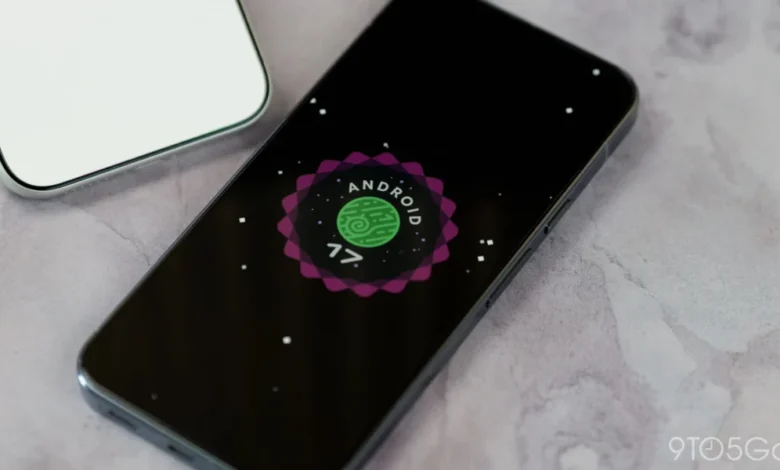
The rollout of the Android 17 QPR1 (Quarterly Platform Release) stable update has brought about a series of subtle yet noticeable interface adjustments for Google Pixel users, sparking debate among the community regarding the consistency of the mobile operating system’s design language. Among the most prominent changes observed in this week’s stable OTA (Over-the-Air) release are alterations to the status bar icons for both the silent mode and VPN connectivity. These modifications appear to have been implemented at the eleventh hour, as they were conspicuously absent from the extensive Beta testing cycle that preceded the final public release.
A Regression in Visual Language
The most immediate change noted by users involves the status bar icon used to indicate that a device is set to silent or mute. Historically, Google transitioned from a bell icon to a crossed-out speaker icon during the development of Android 14 to provide a clearer, more intuitive visual representation of a deactivated audio profile. This design choice remained the industry standard for the Android ecosystem for several iterations.
However, with the arrival of Android 17 QPR1, the silent icon has reverted to a bell symbol. This shift has prompted speculation that the change may be an accidental regression—a technical oversight where a legacy asset was inadvertently reintroduced into the build process. Adding weight to this theory is the fact that the volume slider’s internal interface, located at the top of the system UI, continues to utilize the bell icon, creating a visual inconsistency between the status bar and the volume control panel. Furthermore, the Android 17 QPR2 Beta 5—a build currently running in parallel—still features the previous speaker icon, suggesting that the development team may not have intended for this reversal to reach the public stable branch.
The VPN Icon Redesign
In addition to the silent mode icon, the status bar now displays a significantly altered VPN icon. Unlike the previous version, which featured a lighter, more minimalist line-art style consistent with Google’s "Material You" design guidelines, the new iteration is thicker and entirely filled in. This aesthetic shift marks a departure from the established design principles that prioritize thin, adaptive iconography.
Similar to the silent mode icon, this change appears to be isolated to the stable QPR1 release. It was not documented in the developer changelogs, nor was it present in the preview builds distributed to the Android Beta Program participants. The sudden introduction of these icons in the final build without prior public testing suggests a discrepancy in the internal build management process, where the stable branch may have been compiled using a repository that included assets not yet approved for the wider Android 17 release cycle.
Chronology of the Android 17 Update Cycle
To understand the scope of these changes, it is necessary to examine the timeline of the Android 17 development process. Android 17 was designed as a refinement-focused update, emphasizing system stability and modularity.
- Initial Beta Phase: Throughout the early months of 2026, the Beta builds focused on performance improvements, battery optimization, and API stability. During this period, the status bar icons remained consistent with the design language established in Android 16.
- The QPR1 Beta Cycle: As the QPR1 branch entered testing, feedback from developers and enthusiasts highlighted a focus on refining notification management and security features. No icon changes were reported or highlighted during this phase.
- The Stable OTA Launch: This week, the rollout of the stable Android 17 QPR1 update reached Pixel devices. Within hours of the release, users on forums and social media platforms identified the discrepancies in the status bar.
- Current State: As of the time of reporting, Google has not released a statement addressing the icon changes. Meanwhile, users on the QPR2 development track continue to see the older, consistent icon set, highlighting a widening gap between the different tiers of the Android 17 release schedule.
Technical Implications of UI Regressions
While a change in icons may seem trivial to the average consumer, it holds significant implications for Google’s design system, known as Material Design 3. Maintaining a cohesive visual language across a massive, fragmented ecosystem like Android is a monumental task. When system-level icons deviate from the established style, it can lead to "UI debt," where future designers and engineers struggle to maintain consistency.
The fact that the VPN icon and the silent mode icon changed simultaneously suggests a deeper issue in the asset management pipeline. It is highly likely that a recent "build sync" between the internal Google repository and the public release branch included assets intended for a different design iteration or an experimental branch that was not meant to go live.
For the end user, this inconsistency creates friction. Visual cues are designed to be processed subconsciously; when those cues change unexpectedly, it forces the user to re-learn the interface, even if the change is minor. This is particularly problematic for accessibility, as many users rely on familiar icons to quickly assess their device’s status at a glance.

The Path Toward Resolution
Industry observers and software analysts suggest that if this change was indeed an error, it is unlikely to be corrected immediately. Because the Android update process for Pixel devices follows a strict schedule, individual "hotfixes" for UI elements are rarely deployed outside of scheduled updates.
Given that the Android 17 QPR1 update is already in the hands of millions of users, the most probable timeline for a correction would be the upcoming QPR2 release, which is expected in December. By then, the development team will have had time to reconcile the assets between the stable branch and the ongoing beta branch. It is worth noting that Android 17 QPR1 has not yet reached the Pixel 11 series, which may suggest that the company is taking extra precautions with its newest flagship hardware before pushing the latest updates.
Broader Impact on the Pixel Ecosystem
The situation highlights the challenges of maintaining a "clean" Android experience on Pixel devices. While the Pixel line is intended to be the reference implementation of Android, the pressure to deliver frequent, feature-rich updates often leaves little room for rigorous final-stage regression testing.
Google’s design language has undergone numerous shifts since the inception of Material You, and while the company frequently touts its commitment to user-centric design, occurrences like these remind the public that even the most controlled software environments are subject to the complexities of modern, large-scale software engineering.
For the time being, Pixel users are left to navigate a slightly altered interface. While it does not hinder the functionality of the device, it serves as a case study in how minor deviations in a platform’s visual identity can ripple through a community, prompting discussions about quality assurance and the necessity of maintaining a singular, unified design vision. Whether this shift represents a genuine design pivot or a fleeting technical error remains to be confirmed by official sources, but for now, the status bar remains a point of contention for those who value visual consistency in their mobile experience.