Google brings Liquid Glass design to iOS apps as Material 3 rollout continues

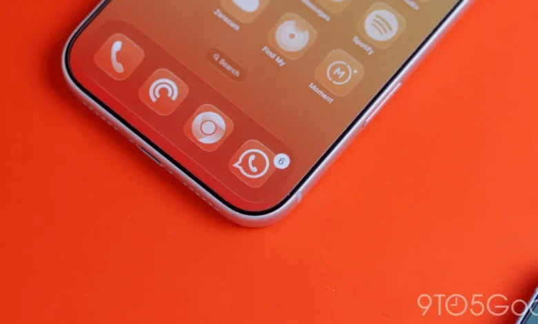
The visual identity of Google’s application suite on iOS is undergoing a significant transformation, marking a departure from the static, opaque design paradigms that have defined the company’s mobile software for the better part of a decade. One year after the debut of its proprietary "Liquid Glass" design language—a specialized aesthetic framework built atop the foundation of Material 3 Expressive—Google has begun implementing these translucent, depth-aware interface elements across its most popular iOS applications. This update, most notably observed in the latest iteration of Google Photos (version 7.94), signals a strategic pivot toward a more cohesive, high-fidelity user experience that seeks to bridge the gap between Google’s platform-agnostic design language and the native sensibilities of Apple’s iOS.
The Evolution of Liquid Glass and Material 3
To understand the significance of this shift, one must look back at the broader arc of Google’s design history. For years, Google’s design strategy relied on "Material Design," a flat, card-based interface language that emphasized clean lines and bold colors. However, as mobile hardware evolved to include higher-density displays and more sophisticated rendering capabilities, the rigidity of early Material Design began to feel dated.
The introduction of Material 3 (also known as Material You) marked a turning point. It introduced "Dynamic Color," a feature that extracts a color palette from the user’s wallpaper to theme the entire system. While this was a revolutionary change for Android, iOS users were largely left behind due to the restricted nature of Apple’s ecosystem. Liquid Glass, therefore, serves as a compromise. It focuses on translucency and blur, mimicking the frosted-glass aesthetic (reminiscent of Apple’s own "Glassmorphism") while retaining the structural core of Material 3 Expressive. By layering these translucent elements, Google creates a sense of spatial hierarchy that was previously missing from its iOS portfolio.
Implementation in Google Photos and Health
The latest update to Google Photos (version 7.94) provides the most concrete example of this transition. Historically, the floating bottom navigation bar in the Photos app was rendered with a solid background, creating a visual "wall" at the bottom of the screen. Under the new design, this element has been replaced with a Liquid Glass container. This allows the underlying imagery—whether it be a user’s photo library or a specific memory—to bleed through the navigation bar, providing a more immersive experience.
Google has introduced two distinct tiers of translucency for this feature: a "Default" setting and a "More clear" option. The former provides a subtle blur that maintains legibility for the icons, while the latter offers a higher degree of transparency, allowing the user to engage more deeply with the content behind the UI elements. Furthermore, in Dark Mode, the interface utilizes the default blue accent color to tint the active tab indicator, creating a sophisticated contrast that feels native to the iOS environment.
![Google combines Material 3 Expressive & Liquid Glass on the iPhone [Gallery]](https://9to5google.com/wp-content/uploads/sites/4/2026/03/Liquid-Glass-dock-on-iPhone-17-Pro-Max.jpg?quality=82&strip=all&w=1600)
Similarly, the Google Health application has integrated Liquid Glass into its navigation structure. The "Ask Coach" floating action button (FAB) now features a frosted, translucent treatment. This change is not merely cosmetic; it serves a functional purpose by reducing the visual weight of the button, allowing the user to maintain focus on their health metrics or educational content while still being able to identify the primary interaction point of the application.
The Phasing Out of Legacy Design
The transition to Material 3 on iOS is an ongoing, multi-year process. While Google has successfully modernized high-traffic apps like Google Tasks, other productivity pillars such as Google Docs, Sheets, Slides, and Keep have remained tied to the older Google Material Theme for longer than anticipated. The persistence of these older design languages highlights the difficulty of updating legacy codebases that are heavily reliant on specific, non-responsive UI frameworks.
The current strategy involves a phased rollout where individual components—such as top bars, floating action buttons, and bottom navigation—are updated in isolation before a full-scale redesign of the application’s architecture is implemented. This granular approach minimizes the risk of breaking functionality in critical business tools like Docs and Sheets, which require high levels of stability. Industry analysts suggest that by the end of the 2026 fiscal year, the majority of Google’s core iOS suite will have completed this transition to the Material 3 Expressive standard, finally bringing visual parity between the Android and iOS versions of their apps.
Challenges of Dynamic Color on iOS
One of the most frequent questions regarding Google’s iOS design choices concerns the absence of Dynamic Color. On Android, Dynamic Color allows the UI to adapt to the user’s personality through wallpaper-based color extraction. On iOS, however, this remains technically unfeasible for Google apps.
The primary hurdle is system-level access. Apple restricts third-party applications from accessing the user’s system wallpaper or applying system-wide color overlays. Without the ability to read the system’s primary theme, Google would be forced to implement a manual color picker or an "in-app" theme selector. While such a feature is technically possible, Google has historically avoided this approach, citing concerns regarding UI consistency. A manual system would likely be perceived as an "add-on" rather than a native feature, and without the deep integration seen on Android, it risks cluttering the settings menu without providing the holistic experience users expect.
As it stands, Google appears content to prioritize the "Liquid Glass" translucent aesthetic, which complements the existing iOS system design, rather than attempting to force a color-dynamic engine that would likely feel out of place in the tightly controlled Apple ecosystem.
![Google combines Material 3 Expressive & Liquid Glass on the iPhone [Gallery]](https://9to5google.com/wp-content/themes/ninetofive/dist/images/google-preferred-source-badge-dark.png)
Broader Implications for Design Parity
The adoption of Liquid Glass across iOS signifies a broader shift in how Google manages its cross-platform product strategy. For years, Google’s apps on iOS were often accused of feeling like "foreign objects" that didn’t adhere to Apple’s Human Interface Guidelines, nor did they fully commit to Google’s own evolving design language.
By embracing Liquid Glass, Google is effectively creating a "third way"—a design language that is recognizably Google (retaining the Material 3 iconography and layout principles) but behaves like an iOS native app (utilizing blur, translucency, and depth). This balance is crucial for user retention. iOS users are notoriously sensitive to UI inconsistencies; apps that look or feel "alien" often see higher churn rates.
Furthermore, this move suggests that Google is investing more heavily in its iOS-specific engineering teams. Updating a design language isn’t just about changing colors; it requires a complete rewrite of the UI component library. This investment indicates that Google views its iOS presence as a strategic priority, equal in importance to its Android ecosystem, regardless of the platform’s limitations regarding system-level customization.
Timeline of Design Evolution
- 2021: Google begins the rollout of Material You (Material 3) on Android, introducing Dynamic Color and a new, more organic design language.
- 2023: Initial rumors emerge regarding the development of "Liquid Glass" as a solution for cross-platform UI rendering.
- 2025: Google begins the initial integration of Liquid Glass components in select iOS apps, starting with background-heavy utilities.
- 2026 (Q1): The design language expands to navigation bars and floating action buttons in Google Photos and Google Health, signaling a broader push across the entire Google ecosystem.
- 2026-2027 (Projected): Final integration of Material 3 Expressive across all remaining Google productivity apps, including Docs, Sheets, and Slides.
Conclusion and Future Outlook
The shift toward Liquid Glass on iOS is a calculated move that addresses both aesthetic and functional demands. By focusing on translucency and modern depth-based interactions, Google is successfully updating its design identity without the need for the system-level permissions required for its Android-based Dynamic Color feature.
While the rollout remains incomplete, the progress observed in the latest updates to Photos and Health suggests that Google has found a sustainable path forward for its iOS design language. For the end user, this translates to a more fluid, responsive, and visually appealing experience that respects the conventions of the Apple platform while remaining firmly rooted in Google’s own design philosophy. As the company continues to sunset the outdated Material Theme, we can expect a more unified and polished suite of tools that bridge the divide between two of the world’s most significant mobile operating systems.
Related posts: