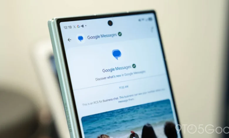
The proposed changes arrive shortly after Google began testing a refreshed app icon, signaling a broader commitment to refining the visual identity and usability of Google Messages. As the platform continues to serve as the backbone for RCS (Rich Communication Services) messaging on Android, these interface tweaks are designed to balance the increasing density of features—such as Gemini integration and enhanced search functionality—with the necessity of maintaining an intuitive user experience.
Evolution of the User Interface: A Chronological Overview
Since the transition from the legacy SMS-based Android Messages to the modern Google Messages platform, the application has undergone several structural transformations. In the early stages of its development, the app prioritized simplicity, functioning primarily as a streamlined replacement for stock carrier messaging apps. However, as Google pushed for global RCS adoption, the app grew in complexity.
The current interface, which many users are accustomed to, utilizes a list-based format where pinned chats occupy the upper portion of the screen, followed by the chronological list of recent conversations. Search is typically housed in a static bar at the top, and a "Start chat" button sits in the lower right-hand corner.
In recent months, the introduction of generative AI through Gemini has further cluttered this space, forcing Google to rethink how users navigate their inbox. The new test indicates a shift away from the static, top-heavy search bar toward a more dynamic, floating interaction model. This aligns with broader trends in mobile design, where developers are increasingly moving critical interface elements toward the bottom of the screen to accommodate the increasing size of smartphone displays and the prevalence of one-handed usage.
Details of the Proposed Redesign
The most striking visual change involves the treatment of pinned chats. Under the experimental design, Google is moving away from the compact, list-based pinning system. Instead, pinned contacts will be represented by larger, circular profile photos arranged horizontally at the top of the interface.
This design shift bears a strong resemblance to the interface utilized by Apple’s iMessage, which also elevates pinned conversations to a distinct, image-heavy tier. While this offers a cleaner visual aesthetic, it presents a functional trade-off: by removing the snippet of the most recent message or the timestamp associated with these chats, the app shifts toward a more "contacts-first" experience rather than a "content-first" one. Users will no longer be able to glance at their pinned threads to see if they have missed a message without interacting with the contact directly.
Parallel to this, the search functionality is receiving a major upgrade. Google is testing a new floating action button (FAB) that consolidates the search function and the "Start chat" command. In this iteration, the buttons are housed in a pill-shaped container.

The interaction model for these buttons is context-aware:
- Default State: When the user is at the top of the conversation list, the button displays a circular magnifying glass icon alongside the text "Start chat."
- Scrolling State: As the user scrolls down the list, the "Start chat" text collapses, leaving a consolidated "Search" pill. This dynamic animation is designed to maximize screen real estate while keeping the search function accessible.
Strategic Implications for Google Messages
The decision to test these changes reflects a deeper strategy to reconcile the app’s identity as both a utility for SMS/RCS and a hub for AI-driven assistance. As Google continues to integrate Gemini into the messaging experience, the "real estate" of the home screen has become increasingly valuable. By moving to a floating, dynamic interface, Google is attempting to mitigate the feeling of clutter that often accompanies "feature creep" in productivity applications.
From a design philosophy perspective, this shift emphasizes "Thumb Zone" accessibility. Modern smartphone ergonomics emphasize that the bottom third of the screen is the most comfortable area for one-handed operation. Moving the primary navigation and search controls from the top of the screen to the bottom, where they are more easily reached by the thumb, suggests that Google is prioritizing speed of interaction.
However, the impact on user workflow remains to be seen. While the new layout is visually modern, it may present a learning curve for power users who rely on the existing, information-dense list format. By hiding the last-sent information for pinned chats, Google is placing a bet that users prefer an aesthetic-focused inbox over a data-dense one.

Supporting Data and Industry Context
The mobile messaging market is highly competitive, with Google Messages competing against WhatsApp, Telegram, and Apple’s iMessage. Industry analysis indicates that user retention in messaging apps is heavily dependent on the "time-to-message"—the speed with which a user can open the app and initiate a conversation.
According to mobile UX benchmarks, apps that implement dynamic, context-aware buttons (like the floating search pill) often see an increase in interaction rates for those specific features. By surfacing the "Search" function more prominently, Google is likely attempting to drive higher engagement with its archival and search-within-conversation features, which have historically been underutilized by the average user.
Furthermore, the shift toward a more visual, profile-based pinned section suggests a move to personalize the app experience. Studies on user interface design suggest that users recognize profile photos and visual avatars significantly faster than they process text-based contact names. By adopting this visual language, Google is catering to the preferences of a younger demographic that favors visual identifiers over textual ones.
Official Stance and Beta Deployment
Google has not yet provided a formal statement regarding the specific timeline for a wide release of these features. In accordance with its standard development lifecycle, the company is using the beta channel to gather telemetry on how these UI changes affect user interaction patterns.

Beta testers are currently encouraged to provide feedback through the Google Messages feedback portal, specifically regarding the fluidity of the new animations and the convenience of the floating search pill. If the feedback indicates that the removal of message previews in pinned chats negatively impacts user efficiency, it is possible that Google will refine the design to include a hybrid approach—perhaps allowing for "expanded" and "collapsed" views of pinned items.
Broader Impact and Future Outlook
The testing of these interface elements is part of a larger trend of "AI-first" design at Google. As the company continues to weave Gemini deeper into its ecosystem, the interface of its core applications must adapt to accommodate new layers of functionality without overwhelming the user.
The potential removal of the dedicated Gemini FAB, which currently exists in many versions of the app, would suggest that Google is looking to move AI interactions away from a separate button and into the standard search and navigation flow. If the search button becomes the gateway to both text-based message searching and AI-driven queries, the application will become significantly more cohesive.
As of late 2026, the trajectory for Google Messages is clear: it is moving away from the utilitarian, text-heavy roots of Android’s past and toward a polished, modern, and highly interactive communication hub. Whether these changes will be embraced by the global user base will depend on how successfully Google manages the balance between aesthetic modernization and functional utility. For now, the beta testing phase remains the critical testing ground for these significant visual and structural shifts.