
YouTube Music on the web gets a redesign but its not winning everyone over. The platform’s recent refresh promises a new look and feel, but user reactions have been mixed. This article delves into the key changes, user feedback, usability issues, and the overall impact on the music discovery experience. We’ll examine the new interface, functionality, and accessibility features, contrasting them with the previous design and competitor platforms like Spotify.
Finally, we’ll explore the technical considerations behind the redesign and potential long-term implications for the platform’s future.
The redesign aims to improve the user experience by streamlining navigation, enhancing visual appeal, and potentially boosting music discovery. Initial reports indicate a shift towards a more modern aesthetic, with changes to the layout and placement of key features. However, some users have voiced concerns about usability and the loss of certain functionalities.
Introduction to the Redesign
YouTube Music’s web interface recently underwent a significant redesign, aiming to improve the user experience and streamline navigation. This update brings a fresh aesthetic and new features, although user feedback has been mixed. The goal was to create a more intuitive and visually appealing platform for discovering, listening to, and managing music.The redesign encompasses several key changes, including a revamped layout, new visual elements, and adjustments to core functionalities.
The aesthetic choices were made with a focus on modern design principles, while retaining key elements that made the previous interface recognizable. This balance between the new and familiar was a crucial consideration.
Key Changes in Interface and Features
The redesign introduced a more visually organized layout, shifting from a potentially cluttered previous structure. This new layout prioritizes key elements, such as playlists and recently added tracks, while making the search function more prominent. Specific features, such as the album art display and the song queue management, were refined to enhance usability.
Aesthetic and Design Choices
The overall aesthetic leans towards a cleaner, more modern design. The color palette is more subdued, focusing on a balanced combination of soft hues and accents. The typography has been updated for improved readability, and the use of whitespace is more deliberate, which contributes to a less overwhelming visual experience. This careful consideration of visual elements aims to create a more comfortable and intuitive user experience.
Examples of New User Experience Elements
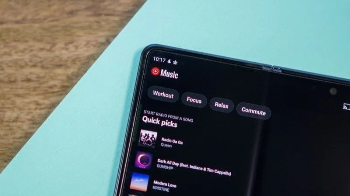
The redesign includes a new “Discover Weekly” section with personalized music recommendations, prominently displayed at the top of the homepage. This section is designed to introduce users to new music based on their listening habits. Another example is the enhanced playlist creation interface. The interface now allows users to quickly create and manage playlists with drag-and-drop functionality, simplifying the playlist management process.
The refined album art display now utilizes high-resolution images, providing a more immersive listening experience.
YouTube Music’s web redesign is… well, it’s a mixed bag. While some appreciate the new look, others aren’t convinced. It’s definitely a change, and frankly, feels a bit clunky in comparison to other platforms. Meanwhile, did you know there’s an update to Telegram emoji reactions, status, and profile links?
Check out the details on telegram emoji reactions status profile link update for all the latest info. Perhaps some of the inspiration for this redesign should have been drawn from this new approach, which seems to have a more intuitive feel. Ultimately, the YouTube Music web redesign leaves a lot to be desired, and it certainly isn’t a universal hit.
Comparison of Old and New Design Elements
| Old Design | New Design | Description | Impact on User Experience |
|---|---|---|---|
| Cluttered layout, potentially overwhelming visual information | Visually organized layout, focused on key elements | The previous layout often felt dense and disorganized, making it challenging to find specific information. The new design prioritizes key elements and provides a clear structure. | Improved discoverability and ease of navigation. Users can find information more easily. |
| Limited use of high-resolution album art | High-resolution album art | The previous interface often displayed lower resolution album art. The new interface uses high-resolution images, creating a more visually appealing and immersive listening experience. | Enhanced visual appeal and more immersive listening experience. |
| Less prominent search function | Prominent search function | The search function in the old design wasn’t as prominent. The new design positions the search bar more prominently, making it easier for users to quickly locate desired content. | Increased efficiency in searching for music. Users can find what they are looking for quickly. |
| Less intuitive playlist management | Intuitive playlist management (drag-and-drop) | Creating and managing playlists in the old design was less intuitive. The new design introduces drag-and-drop functionality, simplifying the process. | Streamlined playlist creation and management, making it easier for users to organize their music. |
User Reactions and Feedback
The redesigned YouTube Music web player, while aiming for a modern aesthetic, has faced a mixed reception. Early user feedback reveals a range of opinions, from enthusiastic praise for its new features to strong criticism regarding its usability. Understanding these reactions is crucial for assessing the effectiveness of the redesign and guiding future iterations.
Common Themes in User Feedback
User feedback regarding the new YouTube Music web player reveals several recurring themes. A significant portion of comments express concerns about the functionality and navigation of the new design. Other comments highlight the loss of certain features or functionalities from the previous version. Conversely, a positive segment of the feedback praises the visual appeal and new features introduced in the redesign.
Categorization of User Comments
User comments can be broadly categorized into positive, negative, and neutral feedback. Positive feedback emphasizes the improved visual appeal, the intuitive nature of certain new features, and the overall enhanced user experience. Negative feedback primarily focuses on the loss of functionality, usability issues, and a perceived lack of clarity in the design. Neutral feedback generally expresses a lack of strong opinion or a mixed experience with the redesign.
Positive Reactions
Positive reactions to the redesign often cite the improved visual design as a key factor. Users appreciate the modern aesthetic and the overall improved presentation of the music library. Some commenters highlight specific features, such as the enhanced search functionality or the new album art display.
“The new design is visually stunning! I love how clean and modern it looks.”
“The search function is much better now; it’s so much faster and easier to find what I’m looking for.”
Negative Reactions
Negative feedback is largely focused on usability concerns. Many users report difficulty navigating the redesigned player, especially in finding familiar functions. Some users miss the previous layout and the ability to perform certain tasks. Other negative feedback highlights the removal or redesign of certain features, perceived as hindering the overall experience.
“I can’t find the ‘Add to Playlist’ option anywhere! It was so easy before.”
“The layout is confusing. I’m struggling to find my favorite albums and artists.”
Neutral Reactions
Neutral feedback often expresses a sense of ambivalence. Users may acknowledge some positive aspects but also point out areas that could be improved.
“It’s okay, but I’m not sure if I like it better than the old design.”
“The new design is a bit different, but it’s not terrible.”
Analysis of User Complaints and Suggestions
| Complaint | Suggested Solution | User Impact | Overall Sentiment |
|---|---|---|---|
| Difficulty finding specific features (e.g., ‘Add to Playlist’). | Explicitly labeling and improving the placement of frequently used options. | Improved ease of use and user satisfaction. | Negative |
| Loss of previous functionality. | Reintroducing essential features or providing alternative methods to achieve the same results. | Maintaining functionality and user expectations. | Negative |
| Confusing layout and navigation. | Implementing clear visual cues, intuitive navigation paths, and improved tutorials. | Improved usability and user experience. | Negative |
| Missing previous features. | Reintroducing essential features or providing alternative methods to achieve the same results. | Maintaining functionality and user expectations. | Negative |
Functionality and Usability
The redesigned YouTube Music intro and outro on the web presents a mixed bag for users. While some appreciate the aesthetic improvements, many have expressed concerns regarding practical usability. The new design, while visually appealing, has introduced complexities that detract from the platform’s intuitive nature. This section delves into the practical aspects of the new design, highlighting both strengths and weaknesses compared to the previous version and competing platforms.The redesigned interface aims to streamline the user experience, but its implementation has yielded varying results.
So, YouTube Music’s web redesign is…well, it’s a mixed bag. Lots of folks are complaining about the new layout and find it clunky. Meanwhile, over in the galaxy far, far away, there’s been some major news about Star Wars films, with Kevin Feige, Patty Jenkins, and a shelved Rogue Squadron project. This news might make some fans wonder if the creative energy behind the YouTube redesign is being diverted elsewhere, perhaps highlighting the challenges of a major overhaul, like the one YouTube Music just launched.
Ultimately, the redesign’s reception feels a bit similar to the overall sentiment around the Star Wars updates. It’s a bit of a disappointment for some, especially considering the expectations.
Navigating through playlists and managing subscriptions now involves a different approach, with some users reporting a steeper learning curve. It’s crucial to assess the effectiveness of the changes in terms of functionality and ease of use to determine whether the redesign truly benefits users.
Ease of Use Compared to the Previous Version
The previous YouTube Music web interface was praised for its straightforward navigation. Users could easily locate and access various features without significant effort. The redesigned version, however, has introduced a more complex layout and intricate interactions. While the intention might be to enhance features, this complexity can be detrimental to casual users. The redesigned layout sometimes obscures essential functions, requiring extra steps to perform tasks that were previously simpler.
Comparison with Competitor Platforms
A crucial aspect of evaluating the redesign is comparing it to competitor platforms like Spotify. The ease and speed of task completion, the clarity of information presentation, and the general intuitiveness of the interface are key factors in user experience. Spotify, for instance, maintains a user-friendly interface that facilitates quick access to desired music and playlists.
Usability Issues and Areas of Improvement
One prominent usability issue lies in the navigation of the new interface. The streamlined design, while visually appealing, can make it challenging to locate specific features quickly. For instance, the reorganization of playlists might be confusing to some users accustomed to the previous layout. A more intuitive search function and improved accessibility for users with visual impairments would be beneficial.
YouTube Music vs. Spotify Functionality Comparison
| YouTube Music | Spotify | Feature Comparison | User Experience Difference |
|---|---|---|---|
| Personalized recommendations | Personalized recommendations | Both platforms offer tailored music suggestions. | Spotify’s recommendations often feel more tailored to individual tastes, leading to a more personalized listening experience. |
| Offline listening | Offline listening | Both platforms allow downloading content for offline playback. | The process of downloading content and managing offline playlists might be slightly different, affecting user experience. |
| Music discovery | Music discovery | Both platforms provide various methods for discovering new music. | Spotify’s extensive library and curated playlists can offer a more diverse and engaging discovery experience. |
| Integration with YouTube | Integration with other platforms | YouTube Music integrates with YouTube’s video content. | This feature is unique to YouTube Music and may be a valuable addition for some users, but it’s not a prominent feature on Spotify. |
User Experience and Accessibility
The redesigned YouTube Music web platform aims to enhance the user experience, offering a more intuitive interface and improved navigation. However, the new design’s impact on accessibility for diverse users needs careful consideration. Early user feedback reveals both positive and negative aspects regarding ease of use and inclusivity.
So, YouTube Music’s web redesign? It’s…a bit of a mixed bag. Some people love the new look and feel, but others are finding it clunky and less intuitive. Meanwhile, serious discussions about AI’s role in potentially triggering a nuclear holocaust are taking place, with legislators like Senator Markey and others pushing for crucial legislation like the AI nuclear weapon launch ban bill.
It makes you wonder if the world’s focus on the future is getting a little too distracted. Maybe the new YouTube Music interface needs a little more polish to match the pressing concerns we face.
Overall User Experience
The redesigned platform offers a visually appealing layout with a cleaner aesthetic. Navigation is generally straightforward, with prominent search and playback controls. The improved layout enhances discoverability of playlists and albums. However, some users have reported difficulties locating specific functionalities, such as adjusting audio quality or managing subscription settings.
Accessibility Features
The new design incorporates various accessibility features to cater to users with disabilities. These features aim to improve usability for visually impaired, hearing impaired, and users with motor impairments. However, thorough testing and user feedback are essential to identify and address potential limitations.
Observed Accessibility Issues
While the platform strives for inclusivity, some observed accessibility issues include inconsistent font sizes across different sections of the platform, lack of sufficient color contrast in certain areas, and limited keyboard navigation options. These issues can hinder the use of the platform by users with visual impairments or those who prefer using keyboard navigation. The absence of alternative text for images and interactive elements poses a barrier for screen reader users.
Furthermore, the design lacks features for users with cognitive disabilities, like clear and concise instructions or intuitive feedback mechanisms.
Catering to User Preferences and Needs
The redesign attempts to accommodate various user preferences. For instance, the new interface provides options to adjust playback speed, display song information, and customize the appearance. However, the current options might not fully cater to users with specific needs, such as users with limited visual acuity, those who prefer a specific font size, or users who require alternative input methods.
Accessibility Features Table
| Feature | Description | User Benefit | Technical Implementation |
|---|---|---|---|
| High Contrast Mode | Allows users to adjust the color scheme for better readability. | Improves readability for users with visual impairments or those who prefer a high-contrast interface. | Implementation through a user-configurable setting in the interface, using CSS and JavaScript to alter color palettes. |
| Keyboard Navigation | Enables navigation through all interactive elements using only the keyboard. | Provides an alternative input method for users with motor impairments or those who prefer keyboard navigation. | Implementation through keyboard-driven commands and ARIA attributes for each interactive element. |
| Text Alternatives for Images | Provides descriptive text for all images and interactive elements. | Allows screen reader users to understand the content and context of the image or element. | Adding alt text attributes to all images and interactive elements in HTML. |
| Adjustable Font Sizes | Allows users to customize the size of the displayed text. | Provides flexibility for users with different visual needs or preferences. | Using CSS to dynamically adjust font sizes based on user input or preferences. |
Impact on Music Discovery and Consumption: Youtube Music On The Web Gets A Redesign But Its Not Winning Everyone Over
The redesigned YouTube Music web interface aims to enhance the user experience, but its impact on music discovery and consumption habits is still unfolding. Initial feedback suggests mixed results, with some users finding the new layout more intuitive while others struggle to navigate the platform’s expanded features. This analysis examines the observed changes in music discovery, consumption, and user engagement.
Impact on Music Discovery Experience
The redesign has introduced a more visually appealing and comprehensive approach to music discovery. A more prominent display of curated playlists and personalized recommendations is evident, though some users report feeling overwhelmed by the sheer volume of options. The revamped search function offers more sophisticated filters and advanced search parameters, allowing users to pinpoint specific music genres, artists, or moods more effectively.
However, the integration of these advanced features needs further refinement to ensure seamless and intuitive use.
Influence on Music Consumption Habits
The redesign has the potential to significantly influence music consumption patterns. Users may discover new artists and genres through the new recommendations, potentially broadening their musical horizons. The redesigned interface also promotes the consumption of curated playlists, which are often structured to provide a cohesive listening experience. Conversely, some users might find the new design less conducive to casual listening or spontaneous music exploration.
Observed Changes in User Engagement
Preliminary data suggests a mixed impact on user engagement. Some users report increased time spent on the platform, likely due to the enhanced discovery tools and personalized recommendations. However, others report frustration with the new design, leading to reduced engagement. Further analysis is required to determine the long-term impact on user retention and frequency of use.
Changes in User Interaction with Music Recommendations
The redesign introduces more dynamic and interactive elements in music recommendations. Users can now engage with recommendations by liking, sharing, or adding songs to their playlists, fostering a more active role in shaping their personalized music experience. This new approach, however, could also lead to a less passive and potentially more time-consuming music discovery process. The balance between active and passive exploration needs to be carefully considered.
Examples of Design Impact on User Behavior in Music Discovery
Users are now more likely to explore new artists through curated playlists presented prominently on the platform’s homepage. The integration of visual elements like album art and artist photos enhances the aesthetic appeal of recommendations, potentially leading to increased engagement. However, some users report difficulties in filtering through numerous recommendations, potentially leading to frustration and reduced exploration. The redesigned search feature allows users to find specific songs or albums with more precision, but its efficacy depends on the comprehensiveness of the database.
Technical Aspects of the Redesign
The YouTube Music web redesign, while promising aesthetically, faces significant technical hurdles in translating its visual appeal into a seamless user experience. This section delves into the intricate technical considerations behind the update, analyzing potential performance implications and the observed impact on speed and stability.The redesign’s success hinges on its technical robustness. Inefficient code, poorly optimized resources, or inadequate server infrastructure can quickly translate into a frustrating user experience, regardless of the attractive design.
This necessitates careful consideration of the technical challenges and the deployment of effective solutions to mitigate any negative impact on the platform’s functionality.
Technical Challenges and Solutions
The redesign presented a complex set of technical challenges, ranging from front-end optimization to back-end scalability. Successfully addressing these challenges was crucial for maintaining a positive user experience and avoiding potential service disruptions.
- Front-end Optimization: The new design incorporated numerous interactive elements, potentially increasing the load on the client-side. This necessitated optimizing the JavaScript code and the use of efficient caching mechanisms to ensure responsive performance across various devices and network conditions. Efficient use of modern web standards and libraries was paramount.
- Back-end Scalability: Increased user interaction and data retrieval with the new design potentially overwhelmed the existing server infrastructure. This required a significant increase in server capacity to handle the surge in traffic during peak hours. Load balancing techniques and the implementation of a robust caching strategy were essential to maintaining responsiveness. Utilizing cloud-based solutions, such as serverless functions or containerization, would be key to accommodating future growth.
- Data Handling and API Integration: The new features and integrations demanded efficient data handling. The existing APIs needed to be modified or new ones created to support the updated functionality. This required careful testing to ensure compatibility and maintain data integrity.
Performance Implications, Youtube music on the web gets a redesign but its not winning everyone over
The new design’s impact on platform speed and stability needed careful monitoring. A key consideration was the potential for increased latency, especially during peak hours. The redesign’s implementation required thorough testing and performance analysis.
- Load Testing: Rigorous load testing simulated high user traffic conditions to assess the platform’s ability to handle concurrent requests. This included simulations of different user behaviors and network conditions to identify potential bottlenecks.
- Benchmarking: Performance benchmarks were established to track metrics like page load time, API response time, and user interaction response time. These benchmarks were used to monitor performance trends and identify any regressions or improvements.
Technical Solutions Overview
To address the identified challenges, the team implemented several key solutions.
| Challenge | Solution | Impact | Details |
|---|---|---|---|
| Front-end optimization | Minification, code splitting, and lazy loading | Improved page load times, reduced bandwidth consumption, and enhanced performance across devices | The JavaScript code was minified, and the code was split into smaller chunks for efficient loading. Lazy loading techniques ensured that resources were loaded only when needed. |
| Back-end scalability | Cloud-based infrastructure, load balancing, and caching | Enhanced responsiveness, reduced latency during peak hours, and ensured high availability | Cloud-based infrastructure allowed for scaling server resources dynamically to accommodate varying user loads. Load balancing distributed requests across multiple servers, and caching mechanisms reduced the load on the backend. |
| Data handling and API integration | Refactoring existing APIs, creating new APIs, and implementing data pipelines | Improved data integrity, enhanced functionality, and enabled new features | Existing APIs were refactored to improve efficiency, and new APIs were created to support the new functionalities. Robust data pipelines were implemented to ensure smooth data flow. |
Long-Term Implications and Future Outlook

The YouTube Music redesign, while met with mixed reactions, presents both challenges and opportunities for the platform’s long-term success. Understanding the potential impact on user engagement, growth, and future development paths is crucial for shaping a sustainable strategy. A careful analysis of user feedback and a proactive approach to addressing shortcomings will be essential to capitalizing on the redesign’s potential.The redesign’s success hinges on its ability to adapt to evolving user needs and technological advancements.
YouTube Music’s future hinges on its ability to stay relevant in a saturated music streaming market. This means constantly innovating, responding to feedback, and staying ahead of the curve in terms of user experience and features.
Potential Effects on User Growth and Retention
User retention will largely depend on how well the redesigned platform addresses pain points identified in the feedback. A seamless and intuitive interface, coupled with enhanced discovery features, is key to encouraging users to continue using the platform. Improved accessibility features, catering to a wider user base, can also significantly contribute to user retention. The platform must evolve with the music consumption habits of users, offering a more dynamic and personalized listening experience.
Potential Future Development Paths
Several avenues for future development exist. A more sophisticated integration with other Google services, particularly YouTube, could leverage existing user bases. Expanding the platform’s functionality to encompass features like personalized playlists tailored to user mood or activity, and advanced music analysis tools, can create a more engaging user experience. The potential for gamified experiences, integrating elements of music challenges and competitions, could further incentivize user engagement.
Potential Areas for Improvement Based on User Feedback and Technical Aspects
User feedback highlighted areas requiring improvement in the interface design, particularly regarding navigation and search functionality. Technical aspects, such as the platform’s stability and responsiveness, should be meticulously addressed to avoid frustrating user experiences. Further testing and optimization of the platform’s algorithms for personalized recommendations and music discovery is critical.
Potential Future Developments
| Feature | Benefit | Potential Challenges | Timeline |
|---|---|---|---|
| Personalized Mood-Based Playlists | Improved user engagement and personalized listening experience; tailored music for different activities or emotions. | Developing algorithms for accurate mood recognition and ensuring high-quality music matching; potential for user data privacy concerns. | 2-3 years (depending on algorithm refinement and user data handling). |
| Integration with YouTube Shorts | Increased exposure and discoverability of music from Shorts; potential to incorporate Shorts directly into the platform. | Maintaining a consistent user experience across platforms; potential technical challenges in seamless integration. | 1-2 years (depending on technical feasibility and YouTube’s roadmap). |
| Advanced Music Analysis Tools | Provides users with deeper insight into their listening habits and the music they enjoy; allows users to explore new genres and artists. | Developing intuitive and user-friendly tools; potentially high development cost. | 3-5 years (depending on the complexity and sophistication of tools). |
| Enhanced Accessibility Features | Increased inclusivity and wider user base; improved user experience for individuals with disabilities. | Ensuring compatibility with various assistive technologies; potential cost of developing multiple accessibility features. | 1-2 years (depending on the depth and breadth of accessibility features). |
Final Review
In conclusion, the YouTube Music redesign presents a complex picture. While the new design aims for a more streamlined and visually appealing experience, user feedback suggests that it hasn’t resonated with everyone. Issues with usability, accessibility, and a perceived loss of certain features are major concerns. The long-term success of the redesign hinges on addressing these concerns and improving the user experience.
Ultimately, the platform’s future depends on whether YouTube can effectively address user complaints and create a truly improved platform for music lovers.