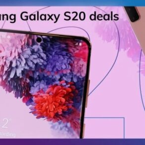
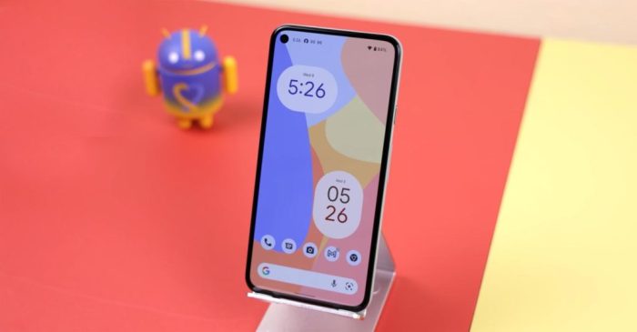
Android 12 material you dynamic color more phones – Android 12 Material You dynamic color is now on more phones, bringing a new level of personalization and visual appeal. This system adapts colors based on your device’s wallpaper, creating a seamless and visually engaging user experience. It’s not just about aesthetics; it’s about how your phone interacts with you, reflecting your unique style.
The dynamic color system in Android 12 Material You allows for a wide range of customization options, letting users personalize their phone’s appearance to match their preferences. This feature enhances user experience by offering a highly personalized and visually appealing interface. The implementation across various phone models, however, shows variations, which we’ll delve into.
Overview of Android 12 Material You Dynamic Color
Android 12’s Material You introduces a dynamic color system that personalizes the user interface (UI) to match the user’s wallpaper. This intelligent approach goes beyond static themes, creating a seamless visual experience that evolves with the user’s choices. The dynamic color system draws inspiration from the user’s chosen wallpaper, extracting key colors and applying them cohesively across various elements of the UI, from app icons to system notifications.
This personalization significantly enhances the user experience, making the device feel more integrated and intuitive.The core principle of Material You’s dynamic color system is its ability to adapt and respond to the user’s wallpaper. By analyzing the dominant colors in the wallpaper image, the system intelligently selects and applies these colors to the interface elements, creating a cohesive and aesthetically pleasing visual environment.
This ensures that the user interface seamlessly blends with the user’s personal style, creating a more engaging and personalized experience.
Key Features of Dynamic Color
The dynamic color system is more than just changing colors; it’s about creating a unified aesthetic. It extracts colors from the wallpaper, and intelligently uses them to create a coherent and visually appealing interface. This includes the following:
- Adaptive Color Palette: The system automatically analyzes the wallpaper’s colors and creates a palette that includes primary, secondary, and accent colors. This ensures a consistent and harmonious color scheme across the entire interface.
- Unified Visual Language: By applying these colors consistently across app icons, system elements, and widgets, Material You creates a unified visual language that feels like a single, cohesive system. This streamlines the user experience and avoids visual inconsistencies.
- Dynamic Theme Adjustment: The system seamlessly adjusts the theme based on the wallpaper’s colors. This includes changes in the notification colors, app icons, and even the system’s navigation bar, creating a dynamic and responsive UI.
- Enhanced Accessibility: The system is designed to be highly accessible. By offering a wide range of color palettes and options, it aims to improve the user experience for individuals with visual impairments.
Implementation in Android 12 Apps
Material You’s dynamic color system is not limited to the system UI. Apps are designed to integrate with this system, resulting in a consistent user experience across the entire platform.
- Personalized App Icons: Apps can utilize the extracted colors from the user’s wallpaper to dynamically adjust their icons. This reinforces the cohesive visual identity and makes apps feel more integrated with the overall system aesthetic.
- Customizable Notification Colors: Notifications can adapt to the dynamic color scheme. This not only makes notifications visually distinct but also seamlessly integrates with the overall theme.
- Adaptive Widget Styling: Widgets can reflect the dynamic color palette, further enhancing the consistent visual experience. This ensures a cohesive look and feel, regardless of the widget type or content.
Impact on User Experience, Android 12 material you dynamic color more phones
The dynamic color system significantly impacts the user experience by providing a more personalized and aesthetically pleasing environment. It helps users feel more connected to their device, enhancing the sense of ownership and customization.
- Enhanced Visual Appeal: The personalized color scheme creates a visually appealing and intuitive interface. Users feel a sense of ownership and connection to their device.
- Improved Brand Consistency: Apps and system elements now share a unified visual language, enhancing brand consistency across the platform.
- Increased Engagement: The adaptive nature of the system makes the interface more engaging and responsive, drawing users into the visual experience.
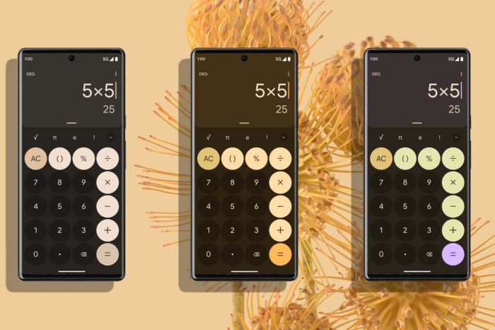
Dynamic Color Implementation Across Phones
Material You’s dynamic color system, a cornerstone of Android 12, promises a personalized visual experience tailored to each user’s wallpaper. However, the reality of implementation across different phone models varies significantly. This disparity highlights the challenges in achieving consistent and high-quality dynamic color rendering across a wide range of hardware configurations.The dynamic color system, while theoretically powerful, depends heavily on the underlying hardware capabilities of the device.
Different phone manufacturers may have varying degrees of optimization and control over the color rendering process. This leads to differences in the quality and responsiveness of the dynamic color system across devices.
Range of Android 12-Compatible Phones
A broad spectrum of Android 12-compatible phones support the Material You dynamic color system. This includes devices from various manufacturers, each with its own hardware and software configuration. However, the level of support and the quality of implementation can differ greatly. The key is not just compatibility but also the effectiveness of the color rendering.
Variations in Dynamic Color Support Among Phone Models
The implementation of dynamic color varies significantly between different phone models. Some devices may exhibit smooth and accurate color transitions, reflecting the wallpaper in real-time. Others may show a less responsive or less accurate representation. This disparity stems from differences in hardware capabilities, software optimizations, and the degree of control over the color rendering process.
Factors Influencing Dynamic Color Implementation Quality
Several factors influence the quality of dynamic color implementation on different phones. The processing power of the phone’s CPU and GPU plays a crucial role. Efficient handling of color calculations and transitions is essential for a smooth user experience. Furthermore, the quality of the display panel itself significantly impacts the vibrancy and accuracy of the dynamic colors.
Android 12’s Material You dynamic color system is really cool, offering more phone customization options. This trend aligns nicely with Google’s push to make affordable phones more accessible to consumers, as detailed in the recent Google Android One US low-cost report. The improved customization in Android 12, combined with more budget-friendly phone options, will likely lead to increased market share and adoption.
The display’s ability to accurately reproduce a wide range of colors, and its responsiveness, directly influences the visual impact of dynamic color. Finally, the manufacturer’s software optimization and integration of the dynamic color system within the overall Android 12 experience are critical. A well-integrated system leads to a more seamless and engaging user experience.
Impact on User Experience
Material You’s Dynamic Color system in Android 12 offers a significant shift in user experience, moving beyond static themes to a more personalized and visually engaging interface. This dynamic adaptation to user environments and preferences creates a richer and more immersive experience. It enhances the overall aesthetic appeal of the operating system while offering a tailored visual identity for each user.The dynamic color system adapts to the user’s wallpaper, automatically adjusting the colors of the interface elements to complement the background.
This creates a seamless visual harmony, avoiding jarring contrasts and enhancing the overall visual appeal of the phone. It also provides a sense of customization, going beyond basic theme choices to allow for a truly unique experience.
Visual Appeal and Personalization
The dynamic color system significantly enhances the visual appeal of the Android 12 interface. By adjusting colors to match the wallpaper, the user interface becomes more cohesive and aesthetically pleasing. This results in a more visually appealing and engaging experience for the user. Users can tailor the color scheme to match their personal style and preferences. This personalization is a key aspect of the improved user experience.
Benefits and Drawbacks of Dynamic Color
The dynamic color system in Android 12 offers several benefits. It provides a more personalized and aesthetically pleasing user interface, adapting to individual preferences. It also enhances the visual appeal of the phone, leading to a more engaging user experience. However, some users might find the dynamic color system distracting or overwhelming, especially if their wallpaper is too complex or contains too many colors.
Careful consideration of wallpaper selection can help mitigate potential drawbacks.
Psychological and Emotional Impact
The psychological and emotional impact of dynamic color is multifaceted. The system’s ability to match colors to user preferences creates a sense of personalization and control, leading to positive emotional responses. This can improve user satisfaction and engagement. However, the system might not be suitable for users who prefer a more muted or neutral color scheme. The visual consistency, however, fosters a sense of harmony and cohesiveness, which can have a positive impact on the user experience.
Comparison of User Experiences Across Phones
| Phone Model | Dynamic Color Implementation | User Experience |
|---|---|---|
| Google Pixel 6 | Excellent implementation; smooth color transitions and consistent color matching with wallpapers. Wide range of wallpaper compatibility. | Highly positive; users report a significant improvement in visual appeal and personalization. A seamless integration of the dynamic color system with other features like app customization and accessibility settings. |
| Samsung Galaxy S22 | Good implementation; generally effective color matching but might exhibit slight inconsistencies in certain wallpaper scenarios. The system sometimes struggles with highly complex or saturated wallpapers. | Positive; users appreciate the dynamic color adjustments, but some report occasional visual glitches or color mismatches. |
| OnePlus 10 Pro | Solid implementation; consistent color matching with wallpapers, though color transitions can sometimes be a bit abrupt. A smooth integration with other features. | Positive; users find the system generally pleasant but suggest refinements in color transition smoothness. |
Design Considerations for Developers
Embracing Material You’s dynamic color system in Android 12 applications requires a thoughtful approach. Developers must consider how their apps will adapt to the diverse range of colors and styles offered by the user’s device and chosen color scheme. This section delves into the critical design considerations, providing examples and best practices for seamlessly integrating dynamic color into the user interface.
Understanding Dynamic Color Adaptation
The core principle behind Material You’s dynamic color is its adaptability. Apps should not be static but should react to the user’s device theme. This means components like buttons, text fields, and background elements should dynamically adjust their colors and styles based on the user’s preferred color palette. For example, an app’s primary color could change from a vibrant blue to a calming green based on the user’s chosen accent color.
This responsiveness enhances the user experience, making the app feel integrated with the device’s overall aesthetic.
Designing for Dynamic Color Variations
When creating interfaces that use dynamic color, developers should consider various color schemes. An app should work flawlessly regardless of whether the user has chosen a light or dark theme. This requires careful planning and design choices. Buttons, text colors, and backgrounds should be designed to remain legible and visually appealing across different color palettes. For instance, a button’s text color should always contrast sufficiently with its background color to maintain readability.
Best Practices for Implementing Dynamic Color
A crucial best practice is to use the Material Design color system as a guide. This ensures visual consistency and enhances the user experience. Furthermore, developers should thoroughly test their applications on various devices and themes to guarantee that the dynamic color system functions flawlessly across the spectrum of Android devices and their color schemes.
Color Palette Considerations
Apps should not rely solely on dynamic color. A well-defined color palette provides consistency and brand identity. Using Material Design’s color palettes ensures a consistent look and feel across the entire app. Consider using Material Design’s recommended color palettes to create a cohesive and visually appealing user interface.
Android 12’s Material You dynamic color system is really cool, making phones look more personalized. It’s interesting to see how these color themes translate to other tech, like the Polestar 3 EV SUV’s sneak peek polestar 3 ev suv sneek peek. The sleek design hints at a similar attention to detail in the color choices, which is exciting for future Android phone designs.
Hopefully, these aesthetic advancements continue with the Android 12 Material You dynamic color feature.
Table of Design Principles for Material You Dynamic Color
| Design Principle | Explanation | Example |
|---|---|---|
| Principle 1: Color Contrast | Ensure sufficient contrast between foreground and background elements to maintain readability, regardless of the dynamic color theme. | A button’s text should be a dark color on a light background, and vice versa, to maintain readability in both light and dark modes. |
| Principle 2: Theme Consistency | Maintain a consistent visual language across all app components. Colors and styles should adhere to the user’s chosen theme. | Use the same color palette for buttons, text fields, and other elements throughout the app, adjusting to the dynamic color theme. |
| Principle 3: Accessibility | Prioritize accessibility by ensuring sufficient color contrast for users with visual impairments. | Use Material Design’s accessibility guidelines for color contrast to ensure that all users can interact with the app effectively. |
| Principle 4: Performance | Optimize the implementation of dynamic color to avoid performance bottlenecks. | Use efficient methods to update UI elements when the dynamic color theme changes to avoid lag or slowdowns. |
Future Trends and Predictions
Material You’s dynamic color system has quickly become a defining feature of Android’s design language. Its ability to seamlessly adapt to user-selected colors and device hardware has proven popular, prompting anticipation for its future evolution. The potential for deeper integration with other aspects of the Android experience, including personalization and accessibility, is significant.The future of dynamic color on Android likely involves a shift from simple color matching to a more sophisticated approach that incorporates contextual awareness.
This could involve using user behavior and environmental data to further refine the color palette, leading to more personalized and adaptive user experiences. The system might also be more interconnected with other Android features like widgets and notifications, allowing for a more unified and visually cohesive user interface.
Potential Future Developments
The dynamic color system is poised to evolve beyond its current implementation. One possibility is the integration of user-defined color themes beyond the primary color. Imagine a user defining a specific color scheme for a particular app or group of apps, seamlessly adapting the UI elements to match their preferences. Furthermore, the system could anticipate user needs and suggest appropriate color schemes based on the current time of day, user location, or even the task they are performing.
This would create a truly adaptive and context-aware user experience.
Expansion of Use Cases
Dynamic color’s impact extends beyond the simple application of colors. The potential to integrate it with accessibility features is substantial. Users with visual impairments could customize the system to emphasize specific UI elements with higher contrast or different color palettes to improve readability and usability. Dynamic color could also be leveraged in a way that anticipates user needs.
For instance, the system could adjust the color intensity based on the ambient light conditions in a room, optimizing the visual experience for the user.
Challenges and Opportunities
Implementing a truly dynamic color system across a vast range of Android devices and applications will present some challenges. Ensuring consistency and performance across different hardware configurations is crucial. Compatibility with older devices and applications is also an important consideration. However, the opportunities are significant. A sophisticated dynamic color system could lead to a more personalized and engaging user experience, encouraging greater user adoption of Android devices and applications.
Android 12’s Material You dynamic color system is bringing a fresh, personalized look to more phones. It’s a cool feature, but the news of Pele, the global soccer legend, passing away at 82, forever the king of football is a much heavier one. Still, with Material You, you can now customize your phone’s color scheme to match your wallpaper, keeping things visually engaging even during a somber time.
The integration with accessibility features could dramatically improve the user experience for a broader range of users.
Potential Limitations
While the potential for dynamic color is immense, there are potential limitations to consider. The complexity of dynamically adjusting colors across various apps and devices could impact performance. The system might require significant resources to process the necessary calculations and adjustments, potentially affecting battery life on some devices. Maintaining a balance between personalization and consistency will be critical in ensuring a positive user experience.
Additionally, ensuring that the dynamic color system remains user-friendly and avoids unintended consequences, such as causing discomfort or confusion for some users, will be paramount.
Illustrative Examples of Dynamic Color in Action

Material You’s Dynamic Color isn’t just a pretty feature; it’s a powerful tool for creating visually engaging and contextually relevant apps. By adapting to the device’s color palette, Dynamic Color elevates the user experience beyond static themes, offering a more harmonious and personalized look. This section delves into practical applications of Dynamic Color, showcasing its impact on various app elements.Dynamic Color seamlessly integrates into the user interface, making apps feel more integrated with the device’s aesthetic.
Instead of relying on pre-defined color schemes, apps can leverage the system’s color palette to ensure visual consistency and enhance user immersion. This allows for a dynamic visual language that adapts to different device settings, user preferences, and even the time of day.
Different App Scenarios Utilizing Dynamic Color
Dynamic Color isn’t limited to a single app type. Its flexibility allows it to enhance numerous applications, including photo editing apps, social media platforms, and productivity tools. The adaptability of Dynamic Color allows developers to create visually rich and intuitive experiences across various categories.
- Photo Editing Apps: A photo editing app could dynamically adjust the color palette of its tools and interface elements based on the dominant colors in the image being edited. For instance, if the image is primarily blue, the app’s color scheme might subtly shift towards blues and related shades. This visual coherence helps create a more unified and aesthetically pleasing experience.
The toolbars and other interactive elements would also dynamically adjust, creating a more seamless and contextually aware visual experience.
- Social Media Platforms: A social media app might adjust the color of posts, comments, and profile elements based on the user’s device’s color palette. This approach enhances the user experience by ensuring that the app visually integrates with the user’s device. For example, the app could shift the background colors of various components, such as the newsfeed or the profile page, based on the dominant color scheme of the user’s device.
A user with a device featuring a predominantly red theme might experience a similar red hue in the app’s interface elements, creating a unified visual style.
- Productivity Tools: A calendar app could use Dynamic Color to adapt the colors of events based on the time of day or the importance of the event. For instance, upcoming important events might be highlighted in vibrant colors that stand out against the overall color scheme. The app could also adjust the color of the day’s agenda, ensuring the color of the calendar entries, event cards, and even the calendar grid itself are seamlessly integrated with the device’s color scheme.
Hypothetical App: “ColorFlow”
Imagine a music streaming app called “ColorFlow.” This app leverages Dynamic Color to create a visually engaging experience tailored to each user’s device.
- Dynamic Album Art: The album art for each song would adjust its color palette based on the device’s dominant colors. If the user’s device has a cool color scheme, the album art would shift towards cooler colors, making the artwork visually appealing within the user’s device’s overall aesthetic. This integration makes the artwork more visually engaging, matching the overall theme of the user’s device.
- Theme Adaptability: The app’s entire color scheme—including player controls, playlist backgrounds, and notification banners—would dynamically adjust to match the device’s color palette. This adaptability creates a cohesive and personalized experience, making the app seamlessly integrate with the user’s device’s aesthetic. The color of the playback controls, the playlist background, and even the notification banners would dynamically adjust to match the device’s theme.
- Interactive Elements: Buttons, sliders, and other interactive elements would use Dynamic Color to change their appearance based on the context. For example, a button highlighting a favorite artist might shift to a more vibrant color based on the device’s theme. This enhancement makes the app more intuitive and visually appealing, as the interactive elements would reflect the user’s device’s overall theme.
These examples demonstrate the versatility of Dynamic Color in creating a personalized and visually rich user experience. The adaptability and flexibility of Dynamic Color allows developers to create applications that are not only functional but also visually appealing and seamlessly integrated with the user’s device.
Customization Options: Android 12 Material You Dynamic Color More Phones
Material You’s Dynamic Color system offers a rich tapestry of personalization options, allowing users to tailor their Android 12 experience to their aesthetic preferences. Beyond the automatic color adjustments, users can influence the hues and tones applied across their devices. This granular control empowers users to curate a visual identity that reflects their individual style and preferences.
Available Customization Options
The Dynamic Color system in Android 12 provides a degree of customization, although not as comprehensive as some other personalization options. Users can influence the color palette by adjusting the system’s color extraction methods. This impacts the tones and shades applied to various interface elements, ranging from app icons to widgets and system settings.
Personalization Through Color Extraction
The system allows users to influence the colors extracted from their wallpaper. This means users can select wallpapers with colors that align with their desired aesthetic, directly affecting the Dynamic Color palette. This is particularly valuable for users who want to maintain a consistent color scheme throughout their device’s interface.
Limitations of Customization
While the Dynamic Color system allows a degree of personalization, there are limitations. The customization options do not allow users to choose specific colors for every single element. Instead, the system relies on a color extraction algorithm to derive the color palette. Furthermore, the customization options are integrated into the system settings, rather than offered as a standalone application or a broader suite of tools.
Customization Process Flowchart

Note: The flowchart above is a visual representation and not a fully functional tool. It depicts the general process of customizing Dynamic Color settings.
| Step | Action |
|---|---|
| 1 | Access system settings. |
| 2 | Navigate to the ‘Display’ or ‘Appearance’ settings section. |
| 3 | Locate the ‘Dynamic Color’ option. |
| 4 | Select the desired wallpaper. |
| 5 | Observe the resulting Dynamic Color palette applied to the interface elements. |
Closure
In conclusion, Android 12 Material You’s dynamic color system is a significant step forward in mobile personalization. While implementation varies across different phones, the potential for a truly unique and visually engaging user experience is undeniable. The future of dynamic color on Android promises even more innovative possibilities, and we’ll be exploring the exciting developments ahead.